Tuesday, April 11, 2017

FINAL

Note: due to my lack of foresight and situations occurring beyond my control, it is out of my capacity to record my CCR for my final post. I've instead included the transcript of my analysis below. Apologies.


COVER
         The title, as you can see, is "Full Disclosure", which I'm willing to admit is borrowed from the literary club's magazine. I'm actually the art director of the club, so the cover you see for this presentation is the also the one I designed to be used for Electric Ink. For the purposes of this assignment, I'm using the same cover for both.

         The first thing you'll notice about the cover is that unlike most literary magazines, it's hand painted. Most of the covers I found in my research are obviously done digitally, and I can see why that trend persists. They usually end up looking cleaner and more professional. This could be the pretentious artist in me talking, but I feel like something's gained from being able to see the brush strokes in a painting; especially given the magazine's title. Full Disclosure: complete honesty, nothing to hide. It just seems fitting, thematically. 

         For the cover image itself, I tried my best to paint something a bit avant-garde. So, we have a heart bleeding out ink and other writing paraphernalia. It's supposed to be a visual representation of the expression "Art comes from the heart". I didn't mean to keep the white borders around everything; I initially drew them as a temporary boundary between the background and foreground, but they broke up all the negative space so nicely, I decided to keep them. As for the background; I kept it simple and abstract so it wouldn't distract from the foreground. The background, as you're going to see, also serves as the color scheme for the rest of the magazine.


TABLE OF CONTENTS
         Now for the table of contents. Throughout the design process for this page, I kept two things in mind; legibility and color harmony. The color scheme for everything on the page is pulled directly from the cover--the headings, the bubbles in the corners, the page numbers, everything except the text. With all of the other colors on the page anything other than black looked distracting. To keep things simple, I divided the page into two labeled columns. This layout may not be very fancy but it's easy to understand, which is obviously crucial for a table of contents. 
         I added the bubbles in to make the layout seem less top heavy. I got pretty attached to the big, pink title, but it started dominating the entire page; it was actually kind of difficult to focus on anything else. The bubbles provided something interesting to look at at the bottom of he page too, so the viewer's attention wasn't concentrated on one spot. I also used the bubbles to frame the thumbnails for artwork at the bottom. They're tinted so they don't interrupt the color scheme. I find the effect of it all rather aesthetically pleasing. 
         Between the top and the bottom, there's obviously the contents themselves. I wrote short descriptions under the titles in italics; partially to entice the viewer to read the material, and partially to create some visual interest. A completely uniform column of text wouldn't hold the audience's attention very well.
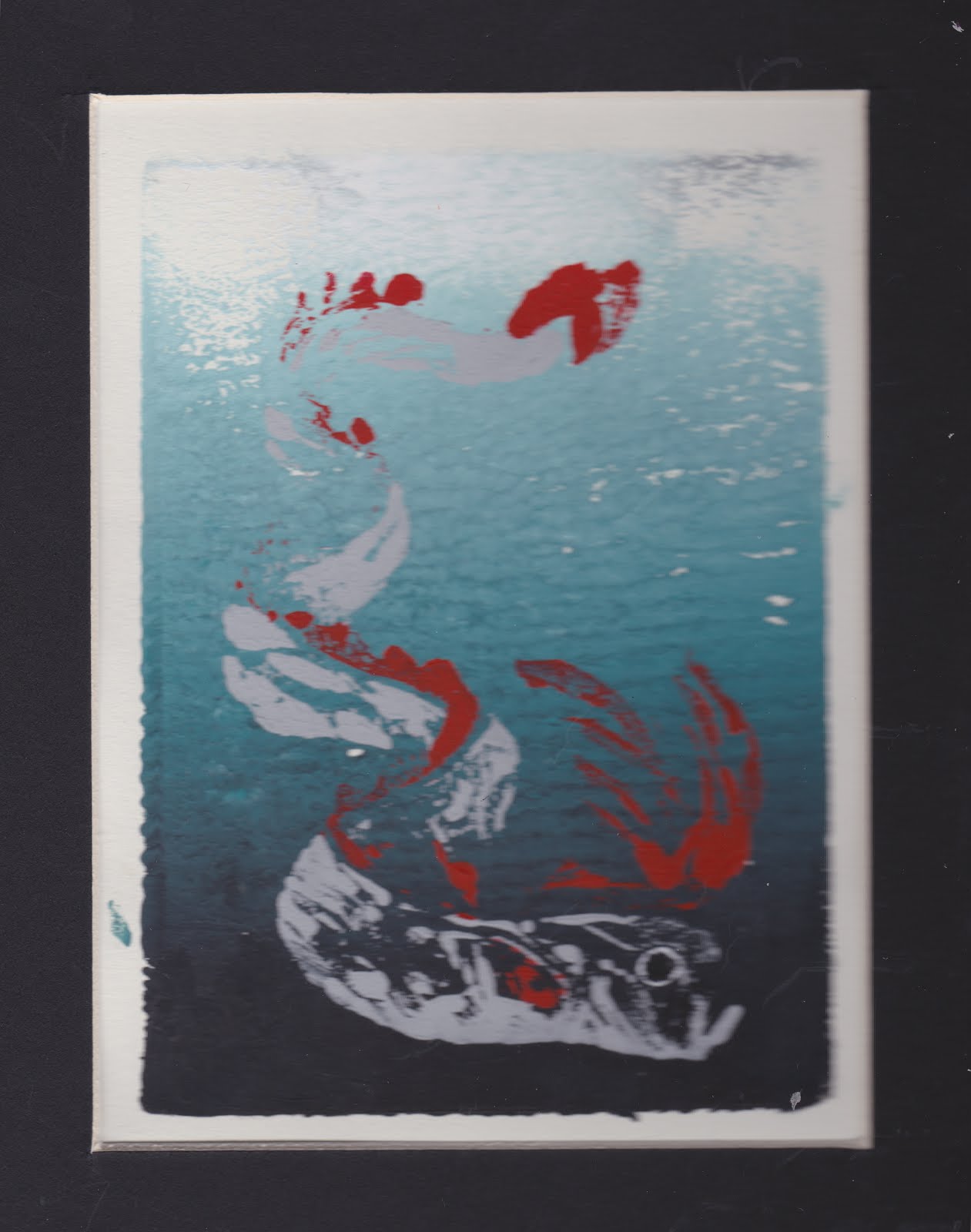

DOUBLE PAGE SPREAD
         In alignment with my fixation on color coordination, I chose to make the title of the page match the artwork on the other side. I was inspired by a particular two-page spread I'd seen "The Walrus", which I've raved about previously in one of my last blog posts.The line under the title/by lines fits into the color scheme as well, while also establishing some semblance of space between the blocks of text.
         Double columns are typically used to contain particularly long pieces of text, but in practice, it looks too cluttered. I decided to stick with a single column for this page's piece of prose instead.

The art is, as I've seen in every example that I could find of this type of spread, thematically connected to the writing. I decided to obey that convention; it didn't make any sense the break it.

Saturday, April 8, 2017

Table of Contents Final

         This post will be brief; I'd just like to display the final results of my TOC. The design below is a WIP picture:


         I enjoyed this one, but several things about it bothered me. It seems too "heavy"  so to speak, on the right side. There's an imbalance of color that makes the viewer skim right over the column on the left. I managed to fix this on the final product:


         Better. It looks more even on both sides now.


Friday, April 7, 2017

Color Palettes cont. (Selecting a Piece of Art for the Double Page Spread)


         Thanks to Canva's color palette generator, I'm now able to catalogue all of my images for my magazine by color groups.

Color Palette of cover
Color Palette of TOC

         After running  a few pieces of artwork for the generator, I've found the closest visual matches to the cover's colors:

The oarfish print...
...And the skinny angel painting
        
          Not a perfect line-up, I'll admit, but the colors are similar enough to look appealing when juxtaposed and are gentle on the eyes.


Table of Contents Progress

         Keeping my previous thoughts on color palettes in mind, I started designing my table of contents:

         As you can see, it isn't a perfect match with the cover:


         This is because I tried to match the colors by eye-balling it. That is, until I realized that canva has this glorious color palette generator. Dragging any image into it reveals the codes for its color scheme, like so:


         With this tool at my disposal, I was able to create a slightly different, albeit a much more attractive table of contents.

Before...
...and After!


         The difference is subtle, but I'm very pleased with it. I can run some of my artwork through the generator to see which one's color palette have the closest match to the cover. However, as it seems that I've already over saturated this post with pictures, I'll save that for another entry.

Thursday, April 6, 2017

Color Palettes

         There's a particular two-page spread from an issue of The Walrus that has remained in my mind throughout my designing process. I believe I included an image of it in a previous blog post:


The Walrus, April 2013

         The reason why this spread appears so appealing is because of its color coordination. The artwork on the right side features a mostly cool color palette (blues, purples, deep pinks, greens, etc.) and the page on the left matches it; the heading is typed out in a soft blue, and the first letter of the text is composed of an amalgamation of colors taken from the color scheme. This creates visual interest and keeps the viewer's eye engaged. 
         I also enjoy how the artwork is themetaically tied to the writing. The piece is a memoir called "The Meaning of White", and if the subheading of this layout is too compressed to be easily read, it says:

         "Science can explain why my daughter has a genetic disorder called albinism, 
           but it is in stories that I find comfort"

         Immediately, the artwork takes on meaning; now there's intention behind leaving the girl in the image uncolored.  I'm trying to replicate this type of design in my own magazine; My cover and table of contents already have matching color schemes. I think it to be in my best interest to pick a piece of art work than continues the trend.

Wednesday, April 5, 2017

Canva (not to be confused with Canvas)

         I'm sure it's possible to create some very high quality content on joomag, as I've seen some beautiful magazine layouts over the shoulders of  my classmates, but after a brief attempt and subsequent failure of desperately trying to figure it out, I decided to use another source. Something I failed to mention in my post about feedback day is the recommendation I was given for a program; canva.com.

         Unlike joomag, canva is free (which is always a perk) and is even available on the app store; I can work on my spreads any time I want. I find the interface of canva to be exponentially easier to use than joomag, and I'll most likely continue using it for the future.

Sunday, April 2, 2017

Potential Canidates For Art

         Before I set out on creating a new piece of artwork for the double page spread, I think it best to consider some paintings and drawings I already have lying around. Tearing apart my house and the files in my computer yielded the following results;


         I think that conceptually, they're decent candidates, but the majority of them are so colorless.

Sunday, March 26, 2017

Cover Progress


         Since every cover for the literary magazines I researched featured a piece of art work, I thought it appropriate to follow the trend. After all, a literary magazine's purpose is to showcase artwork, both literary and visual. Attached below is a WIP image of the cover I handprinted.

Here she is.


         (Forgive the low-quality image; my scanner was broken and I couldn't get better lighting at the time) The title (or at least, the current title) is "Full Disclosure". Artists typically use their craft as an emotional outlet, therefore giving the metaphorical "full disclosure" of their own thoughts and ideas. The cover image features a painting of a hand clutching a heart, squeezing out and propelling ink and writing paraphernalia out of its arteries instead of blood. This is a metaphor (although maybe a bit too on the nose) for the importance of literature, as I'm equating it with blood. Attached below is the cover in a further state of progress:


         The changes made between this picture and the last were made purely for aesthetics. I chose to paint the background with a similar color scheme as the subject to keep it easy to look at. I fear that using a highly contrasting would've made the cover too abrasive on the eyes. The white outlines around everything were drawn to distinguish them from the background. I didn't entirely intend to keep them, but the end result made the cover look like a sheet of stickers, which I found aesthetically pleasing.


Getting Feedback

         Today, my class was divided up into groups so we could critique each other's projects thus far. I'm pleased to say that it was a productive use of time and fairly helpful for myself.

         The people I worked with seemed to share my opinions when it came to designing a literary magazine; omitting cover lines makes for a cleaner and more aesthetically pleasing cover page. I'd already more or less decided to exclude them from my design, but hearing my thoughts reaffirmed by others really pushed me over the fence about it. It think it's worth risking a potential lack of clarity if the payoff is a more attractive cover.
 
         I didn't receive too much constructive criticism, I'm afraid, but I'm more confident that I'm going in the right direction judging by everyone's reactions.

         I'm still a bit torn as to the direction I should go for the two-page spread. I really like all three variants I found in my research--I'd like to experiment with all of them, but I have to be realistic about what I can accomplish in the time that I have left.

         I'm leaning for the "half-and-half" layout I keep seeing in all my examples; there's something striking about it.

Monday, March 20, 2017

Um

         It was bound to happen eventually, but it seems like I've tripped over my first stumbling block for this project; Joomag's interface. I paid for access to Joomag out of pocket, which is fine; the samples look so professional that I'm confident it's worth the little money I was charged.

But.

         I'm a little lost using it for the first time. Considering I'm trying to use it at school on a device I don't own, I don't have any means of downloading any text or images I have prepared to draft a layout. I'll make a mental note of this for the future so I don't waste any of my time.

Sunday, March 19, 2017

Let's Talk About the TOC (Table of Contents)

         I found this very interesting article about the design process go a table of contents. The author deconstructs what can be done to improve a table of contents (that is, to make it legible and attractive without being distracting) by dissecting one pulled from The New Yorker. I know I've crooned about The New Yorker's beauty in the past, but its TOC really does have much to be desired.


         Of this cluttered little TOC, KT Meaney observes; "The New Yorker wants you to quickly recognize its authors, who have been given the most amount of space and typographic attention. Outside of that, content is difficult to locate. This stems from a poor visual hierarchy—limited typefaces, type sizes and line spacing. The choices made here create congestion." 

        I've never considered how much thought goes into designing something as simple as a TOC, but even I can see the problems with this page. Along with Meaney's observations, an entire column's worth of space is being encroached on by some random advertisement; it's really distracting.

         To remedy this, she suggests that "If the ToC were typeset differently—in two columns, not one, with enhanced typographic hierarchy—one could add all necessary content and improve clarity. This way, more text would feel less cramped. A furnished room looks bigger than an empty one."


Citations: Article by KT Meaney  July 10, 2007. "Redesigning The New Yorker, Pt. 2: A Visual Critique." AIGA | the Professional Association for Design. N.p., 10 July 2007. Web. 19 Mar. 2017  

An Observation of the Two-Page Spread


          Moving on from covers, I'm going to discuss my observations of the designs for two-page spreads. During my research I found a noticeable trend;

The Walrus, April 2013

The New Yorker, Nov. 16 2015

Popshot Magazine
         Much like the covers of the literary magazines I've seen, less seems to be more. This type of spread (one side headed with a title and filled with text, the other displaying a piece of thematically relevant piece of art work) seems to be very popular, as it keeps appearing in my searches. Despite the choice words I had for this magazine in my previous, my favorite variation of this layout is The Walrus's. I love how the font for the title and the first letter of the text is stylized and coordinates with the colors of the artwork. It's a small detail, but creating visual interest in a magazine is crucial for holding the audience's attention. 
         
         Though I found myself fixated on The New Yorker during the beginning of this project, I'm starting to gravitate toward other magazines for inspiration. The Walrus and Potshot Magazine have shown themselves to be quite versatile when it came down to two-page spreads. Along with the "half and half" layout I discussed above, the magazines also included:


Full art spreads...

Popshot Magazine


Text overlapping art...

Popshot Magazine
Popshot Magazine


And text wrapping around art (or vice-versa).

Popshot Magazine


The Walrus, Dec. 2013


Potshot Magazine


         I'll keep these layouts in mind for the future; they're too pretty to ignore.


Saturday, March 18, 2017

Anti-Example

         So, it seems like I was mistaken in my previous blog entry; there ARE literary magazines that have cover lines. Case in point, The Walrus.


         Sellouts. Seriously, though, the cover images are very aesthetically pleasing, but there's something so cluttered about this type of design, it bothers me. There's too much going on; compared to most of the other designs I've seen it's abrasive to the eyes. It seems less personal than the design featuring just a masthead.


         I personally prefer a cleaner looking cover for a literary magazine, but I can completely  understand the motivation behind these layouts. Consider this The New Yorker cover:

by Bob Staake, May 2, 2016
         This cover was created as a tribute for pop singer Prince, who died last April. Its design is a nod to the artist's song "Purple Rain", and it's (in my opinion) a clever, tasteful acknowledgment to his death. However, it was this cover that made me realize the major issue (pun not intended) with The New Yorker's choice to exclude any cover lines. Removed from context, the reader gathers no information whatsoever from the cover alone. There's so little to take away visually, it's difficult to tell what it even is. True, covering the... well, cover, of a tribute issue with sensational cover lines would definitely be considered offensive, but this one in particular gives no indication to its contents.


Citations:
Mouly, Françoise, and Mina Kaneko. "Cover Story:." The New Yorker. The New Yorker, 21 Apr. 2016. Web. 18 Mar. 2017

Sunday, March 12, 2017

An Examination of Genre Characteristics

         Before I can start designing anything, I have to research the conventions of the literary magazine genre. There's a bit of overlap between this post and the last; magazine covers are very indicative of their genres after all, but I'll try my best not to repeat what I've already stated before.


Literary Magazines

- Cover text is bold, often in all caps, occasionally in a handwritten style font
         + unorthodox font attracts writers, the intended audience

- Covers are missing barcodes; issues can be distributed online
         + the Internet is always useful for distributing media
       
- No predominate color scheme, but neon colors seem to be avoided
         +The majority of covers and layouts I've seen from The New Yorker, The Kenyon Review, etc., don't stick to particular color scheme; realistic, natural tones, dream-like pastels, and even vibrant hues are utilized in different issues. Eye-catching, but never garish or abrasive.

- Unobtrusive/no cover lines
         + the exclusion of cover lines is so atypical for a magazine, that there must be reason why.            I personally think it's because it makes it less immediately obvious that the magazine is trying to sell itself to the reader; without cover lines, the magazine almost resembles a book. Perhaps this is more attractive to the audience because it looks more academic.

- Two page spreads often dedicate one side entirely or partially to a piece of artwork and allot the rest of the space to unbroken columns of text
         + this places more emphasis on the focal point of the literary magazine: literature


Friday, March 10, 2017

A Good First Impression: A Look at Cover Designs

         My research begins with one of the oldest and most-recognized literary magazines published in the U.S.;  The New Yorker.

 by Christoph Niemann Feb. 23, Mar. 3 
by Adrian Tomine Nov. 8, 2004 
by Malika Favre June 6 & 13, 2016

         What I first noticed was that unlike most magazines, The New Yorker's covers never feature photography of any kind; each issue always displays a piece of artwork. This, evidently, is a characteristic of most literary magazines--which is quite appropriate for a genre that serves to  showcase art.

         There's an implied distaste for "selling out" present in both The New Yorker itself and the general culture of artists. The attempt of capitalizing one's art is generally frowned upon because it's considered to be compromising the integrity of the craft. The covers emphasize the main image above all else; the only text is the dateline, the price, and a modestly sized Masthead. Notice the lack of cover lines; judging by the cover alone, the magazine isn't trying to "sell" the reader anything. The New Yorker relies solely and wholly on its cover art to gather attention.

         And attention it does gather; I personally find the covers to be absolutely beautiful! Many of these designs impress me on an aesthetic level, but a few others stood out for their controversial subject matters.

by Christoph Niemann Nov. 28, 2011

by Barry Blitt Oct. 19, 2016
by Art Spiegelman Mar. 8, 1999

         Whatever it is The New Yorker is trying to say, it certainly isn't going to say it quietly, and this certainly says something about its audience. The magazine doesn't target one gender over the either; the male to female ratio of readers is more or less even. The demographic of its readers hovers around adults in their mid-forties with high incomes. This comes to a surprise to me. Typically, people over the age of thirty tend to be less liberal; I would've thought the audience wouldn't be very perceptive to this content. Either way, the purpose of a literary magazine cover is clear; impress your audience with something visually pleasing  or shock them with something politically charged. In that way, I suppose there's similarities between this genre and most other ones.


Citations:
http://www.megamediamarketing.com/demographics.html


Getting Started

          I spent a great deal of time postponing this assignment simply because I didn't know how to start; I found myself completely indecisive when it came down to choosing a genre. Originally, I considered doing a nature magazine but dropped the idea as I couldn't think of anything engaging enough to write about the subject. However, my current choice now seems so obvious that I'm surprised I didn't consider it earlier--a literary magazine. Considering the fact that I'm the art director for the literary club's magazine this year, this genre seems to be the most fitting choice.
          The Electric Ink Literary Magazine relies on artwork and poetry submitted by students, a practice I obviously can't utilize for this assignment because all text and images included have to be original. However, I do have a presentable amount of original art and writing that I've accumulated over the years. As far as the actual content for the magazine goes, I'm not really concerned about not having enough material.

          I'll be covering the specificities of the genre and its characteristics in the next post.