Tuesday, April 11, 2017

FINAL

Note: due to my lack of foresight and situations occurring beyond my control, it is out of my capacity to record my CCR for my final post. I've instead included the transcript of my analysis below. Apologies.


COVER
         The title, as you can see, is "Full Disclosure", which I'm willing to admit is borrowed from the literary club's magazine. I'm actually the art director of the club, so the cover you see for this presentation is the also the one I designed to be used for Electric Ink. For the purposes of this assignment, I'm using the same cover for both.

         The first thing you'll notice about the cover is that unlike most literary magazines, it's hand painted. Most of the covers I found in my research are obviously done digitally, and I can see why that trend persists. They usually end up looking cleaner and more professional. This could be the pretentious artist in me talking, but I feel like something's gained from being able to see the brush strokes in a painting; especially given the magazine's title. Full Disclosure: complete honesty, nothing to hide. It just seems fitting, thematically. 

         For the cover image itself, I tried my best to paint something a bit avant-garde. So, we have a heart bleeding out ink and other writing paraphernalia. It's supposed to be a visual representation of the expression "Art comes from the heart". I didn't mean to keep the white borders around everything; I initially drew them as a temporary boundary between the background and foreground, but they broke up all the negative space so nicely, I decided to keep them. As for the background; I kept it simple and abstract so it wouldn't distract from the foreground. The background, as you're going to see, also serves as the color scheme for the rest of the magazine.


TABLE OF CONTENTS
         Now for the table of contents. Throughout the design process for this page, I kept two things in mind; legibility and color harmony. The color scheme for everything on the page is pulled directly from the cover--the headings, the bubbles in the corners, the page numbers, everything except the text. With all of the other colors on the page anything other than black looked distracting. To keep things simple, I divided the page into two labeled columns. This layout may not be very fancy but it's easy to understand, which is obviously crucial for a table of contents. 
         I added the bubbles in to make the layout seem less top heavy. I got pretty attached to the big, pink title, but it started dominating the entire page; it was actually kind of difficult to focus on anything else. The bubbles provided something interesting to look at at the bottom of he page too, so the viewer's attention wasn't concentrated on one spot. I also used the bubbles to frame the thumbnails for artwork at the bottom. They're tinted so they don't interrupt the color scheme. I find the effect of it all rather aesthetically pleasing. 
         Between the top and the bottom, there's obviously the contents themselves. I wrote short descriptions under the titles in italics; partially to entice the viewer to read the material, and partially to create some visual interest. A completely uniform column of text wouldn't hold the audience's attention very well.


DOUBLE PAGE SPREAD
         In alignment with my fixation on color coordination, I chose to make the title of the page match the artwork on the other side. I was inspired by a particular two-page spread I'd seen "The Walrus", which I've raved about previously in one of my last blog posts.The line under the title/by lines fits into the color scheme as well, while also establishing some semblance of space between the blocks of text.
         Double columns are typically used to contain particularly long pieces of text, but in practice, it looks too cluttered. I decided to stick with a single column for this page's piece of prose instead.

The art is, as I've seen in every example that I could find of this type of spread, thematically connected to the writing. I decided to obey that convention; it didn't make any sense the break it.

Saturday, April 8, 2017

Table of Contents Final

         This post will be brief; I'd just like to display the final results of my TOC. The design below is a WIP picture:


         I enjoyed this one, but several things about it bothered me. It seems too "heavy"  so to speak, on the right side. There's an imbalance of color that makes the viewer skim right over the column on the left. I managed to fix this on the final product:


         Better. It looks more even on both sides now.


Friday, April 7, 2017

Color Palettes cont. (Selecting a Piece of Art for the Double Page Spread)


         Thanks to Canva's color palette generator, I'm now able to catalogue all of my images for my magazine by color groups.

Color Palette of cover
Color Palette of TOC

         After running  a few pieces of artwork for the generator, I've found the closest visual matches to the cover's colors:

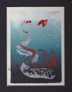
The oarfish print...
...And the skinny angel painting
        
          Not a perfect line-up, I'll admit, but the colors are similar enough to look appealing when juxtaposed and are gentle on the eyes.


Table of Contents Progress

         Keeping my previous thoughts on color palettes in mind, I started designing my table of contents:

         As you can see, it isn't a perfect match with the cover:


         This is because I tried to match the colors by eye-balling it. That is, until I realized that canva has this glorious color palette generator. Dragging any image into it reveals the codes for its color scheme, like so:


         With this tool at my disposal, I was able to create a slightly different, albeit a much more attractive table of contents.

Before...
...and After!


         The difference is subtle, but I'm very pleased with it. I can run some of my artwork through the generator to see which one's color palette have the closest match to the cover. However, as it seems that I've already over saturated this post with pictures, I'll save that for another entry.

Thursday, April 6, 2017

Color Palettes

         There's a particular two-page spread from an issue of The Walrus that has remained in my mind throughout my designing process. I believe I included an image of it in a previous blog post:


The Walrus, April 2013

         The reason why this spread appears so appealing is because of its color coordination. The artwork on the right side features a mostly cool color palette (blues, purples, deep pinks, greens, etc.) and the page on the left matches it; the heading is typed out in a soft blue, and the first letter of the text is composed of an amalgamation of colors taken from the color scheme. This creates visual interest and keeps the viewer's eye engaged. 
         I also enjoy how the artwork is themetaically tied to the writing. The piece is a memoir called "The Meaning of White", and if the subheading of this layout is too compressed to be easily read, it says:

         "Science can explain why my daughter has a genetic disorder called albinism, 
           but it is in stories that I find comfort"

         Immediately, the artwork takes on meaning; now there's intention behind leaving the girl in the image uncolored.  I'm trying to replicate this type of design in my own magazine; My cover and table of contents already have matching color schemes. I think it to be in my best interest to pick a piece of art work than continues the trend.

Wednesday, April 5, 2017

Canva (not to be confused with Canvas)

         I'm sure it's possible to create some very high quality content on joomag, as I've seen some beautiful magazine layouts over the shoulders of  my classmates, but after a brief attempt and subsequent failure of desperately trying to figure it out, I decided to use another source. Something I failed to mention in my post about feedback day is the recommendation I was given for a program; canva.com.

         Unlike joomag, canva is free (which is always a perk) and is even available on the app store; I can work on my spreads any time I want. I find the interface of canva to be exponentially easier to use than joomag, and I'll most likely continue using it for the future.

Sunday, April 2, 2017

Potential Canidates For Art

         Before I set out on creating a new piece of artwork for the double page spread, I think it best to consider some paintings and drawings I already have lying around. Tearing apart my house and the files in my computer yielded the following results;


         I think that conceptually, they're decent candidates, but the majority of them are so colorless.